August 2024
Neumorphism: An Invitation to Interaction

In the world of user interface (UI) design, trends come and go quickly. However, some manage to establish themselves and transform the way we interact with technology. One of these emerging trends gaining traction is neumorphism. But what exactly is neumorphism, and how can it be an effective strategy to increase sales? In this article, we will explore these questions and analyze why neumorphism is much more than a passing fad.
What is Neumorphism?
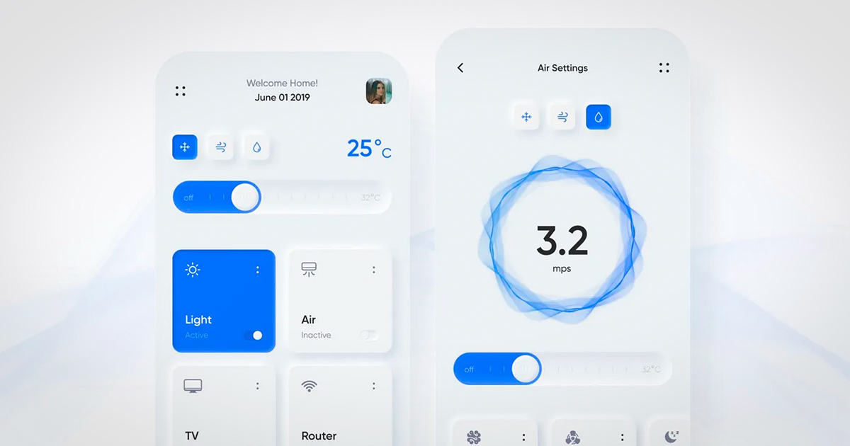
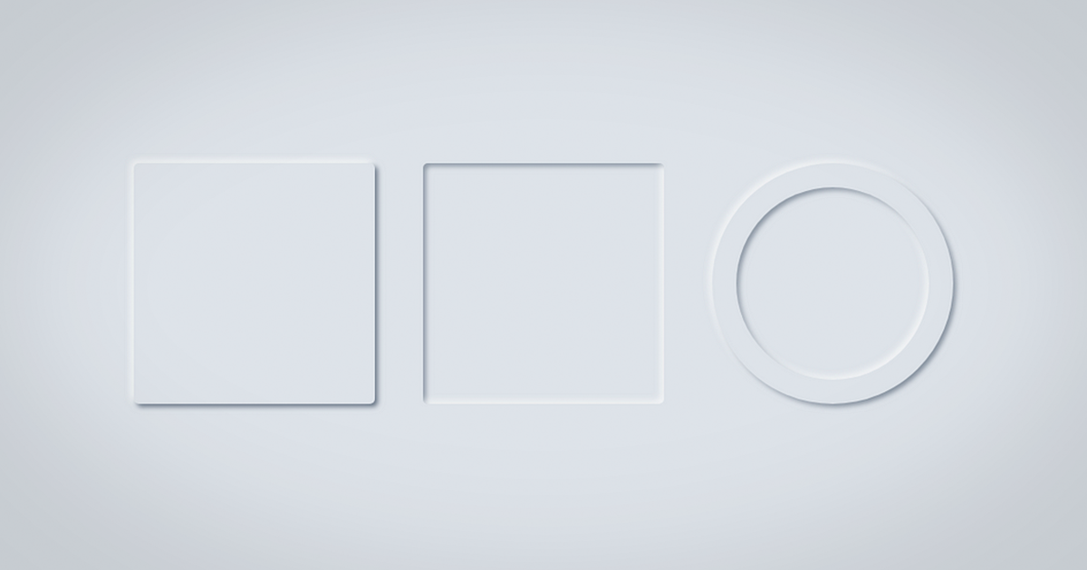
Neumorphism, a combination of "new" and "skeuomorphism," is a design style that seeks to create user interfaces that look realistic and tangible. This approach uses soft shadows and highlights to give the impression that interface elements are "raised" from the background or "pressed" into it, creating a sense of depth and materiality. Unlike flat design, which dominates the current landscape with its simplicity and clarity, neumorphism adds a touch of realism that makes elements appear interactive and palpable. This style is characterized by:
- Soft Shadows: Create an effect of elevation or depression.
- Subtle Highlights: Give the impression that light is hitting the objects.
- Pastel Colors and Neutral Tones: Keep the interface clean and elegant.
- Curves and Soft Edges: Enhance the sense of touch and smoothness.

How Do We Use Neumorphism as a Sales Strategy?
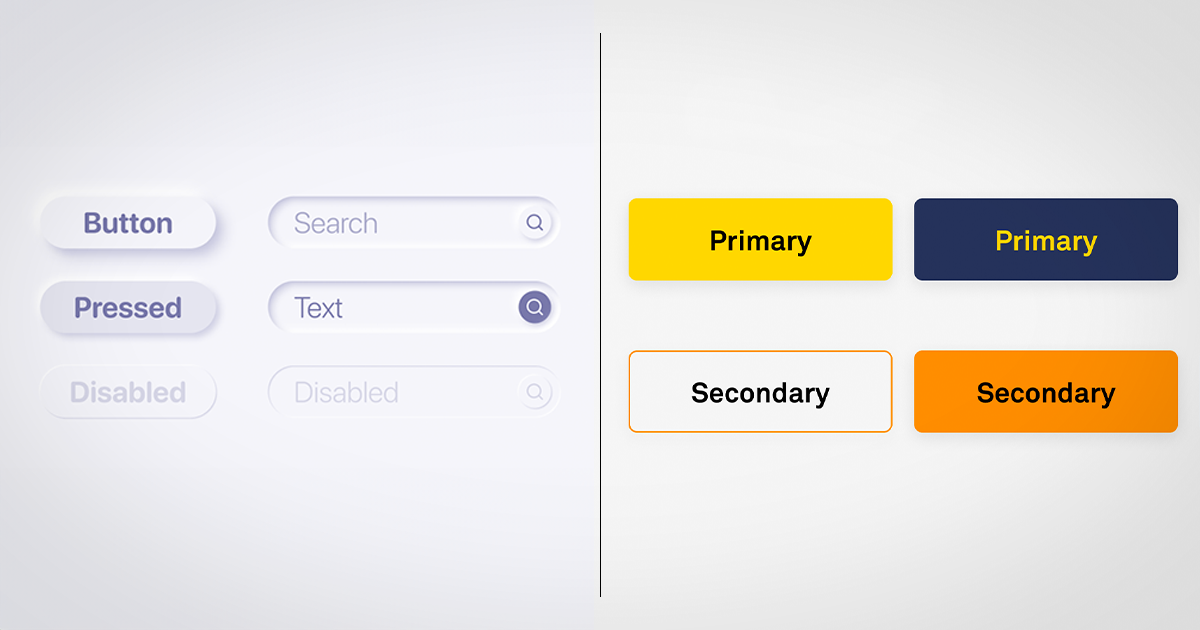
CTA Buttons: In this style, clicking a button is not just about buying a product; it's about making a decision, and the design guides you toward that choice.
Product Sections: Each featured product with neumorphism achieves a showcase effect, creating an aspirational connection with the user.
Contact Forms: Transform this task into a more enjoyable experience. By making the fields more attractive, we tell the user, "Completing this form is easy and quick, go ahead!"
Testimonials: Presenting them with a neumorphic design gives them a touch of authenticity and credibility.
While neumorphism offers numerous benefits, it is important to use it in moderation. An excess of shadows and effects can result in an overloaded and confusing interface. Balance is key to ensuring that aesthetics do not sacrifice usability.

What Do Geeks Think?
Neumorphism isn’t just a passing design trend; it’s an invitation to interaction and can be a powerful tool for enhancing user experience and ultimately boosting sales. When used with moderation and balance, it can transform the way users perceive and interact with your products.
Subscribe to our newsletter to receive more content on the latest design trends.